
It has come to the point at which we’re trying to figure out what’s going on, and the best way to do that is to have a look at the trends.
Whenever the US equities markets fall apart, we channel the late Richard Russell, who read the trends in major indexes through the lens of Dow Theory to come up with an idea about what the markets were telling us they might do.
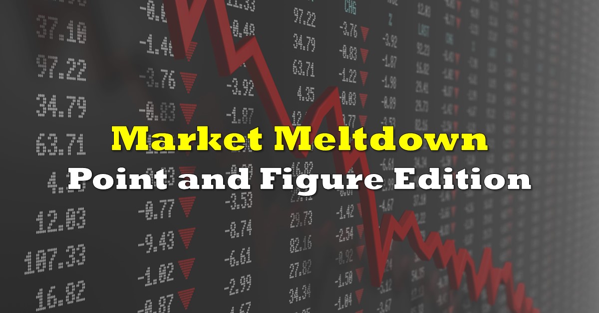
To look at trends and only trends, chartists sometimes use point and figure charts to cut through the noise. P&F charts plot price movements and only price movements over non-regular time scales. Each box represents a standard unit set by the user. In this case, 1% of the Dow Jones Industrial Average and Dow Jones Transportation average, respectively. The rules here are that the chart only gets marked when there’s a movement of 3 boxes or more (3%) upward or downward, regardless of the time it takes for the index to make that move. So, when the price goes sideways, a point and figure chart doesn’t.

X’s are used for upward moves, O’s for downward moves. Time becomes part of the chart itself on a point and figure. The numbers and letters represent the months of the year, beginning in January with “1”, shifting to “A” in October through “C” in December. Years are marked on the bottom axis: notice the irregularity. A P&F will sit in one place for as long as it takes for the price to go up or down by the set percent.
These charts are favoured by long-term outlook types trying to position themselves, and often used by traders who need to step back and figure out what it is they’re trading. As you might have heard on the news, the current trend is distinctly bearish.
The big, long, blue trend line at the bottom of the DJIA point and figure chart indicates that the Dow hasn’t bounced off a downward motion like this in quite some time.

If we scale it down to make the squares represent 3% moves, bringing up a look where a 9% move up or down advances the chart, the trendline reaches back to 2010, when the Industrials rallied 54% following a 33% slide. The move down took two months. The recovery took the better part of a year.

On this look, the Transports index broke the trend line and headed for the floor in the same downward motion as the Industrials, and made less of an attempt at recovery before making an even stronger downward move. The Trannys leading the Industrials is fairly rare – the index usually lags the DJIA and is looked to for a trend confirmation, but the correlation has been known to work backwards. In a crash caused by the economic malaise from a global pandemic, it’s to be expected.
Leave it to Trump to make $200 billion in tax deferrals part of the liquidity solution. The devil is in the details with these types of things. Expect the companies deemed by the Treasury to be “negatively affected,” and therefore eligible for tax deferrals without interest or penalties, to be the companies too strung out to make a note payment.
Corporate bond watch: UPDATE!
Still bad.
We wrote in yesterday’s post about an apparent unsettling weakness in the corporate bond market, pointing out that continued weakness in corporate bonds could represent the market pricing in a potential default, while noting that such a default is unlikely to be isolated. The various corporate bond ETFs didn’t give us much reason to quit giving them the side-eye Wednesday; all of them made further downward moves on volume, swept out on the same tide as the equities markets in an apparent confirmation that the struggle is real for this economy.
The price traders are willing to pay to hang around and see if one of these companies is going to miss a payment and knock over the whole house of cards is still being determined.
This giraffe of a point and figure chart shows that the last time LQD fell 8% was over the course of the entirety of 2014, and the bottom it’s looking to test is from October of 2008… waaaaay down at $49.00

It bears repeating that a) investment grade corporate bonds don’t often see swings like this and b) the short term moves they make are usually inverse to the moves of equities. The bottom coming out of both equities and bonds like this is the market SCREAMING that there’s a structural flaw in the economy, and panic building as everyone heads for the exits all at once.
And, of course, there IS a structural flaw. They cancelled South by South West behind this coronavirus and, besides putting a hold on The Dive‘s plan to start a record label, it serves as a good example of the scale of economic activity that WON’T be happening in the coming months. The fixed income action is the market telling us that it isn’t convinced that all of the US’ major corporate economic components are going to be able to survive the reduction in income.
If the liquidity created by the tax deferral doesn’t bring some stability to the corporate bond markets, well… it’s just going to take more money.
The author has no securities or affiliations related to any organization mentioned. Not a recommendation to buy or sell. Always do additional research and consult a professional before purchasing a security. The author holds no licenses.