


Hey Now! As a little Friday activity I thought I would go though some of the charts illustrating where the economy has landed on at this snapshot in time.
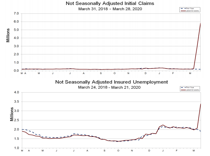
Let’s start by looking at initial unemployment claims in the US, which reached an all time high of 6.6M claims yesterday:
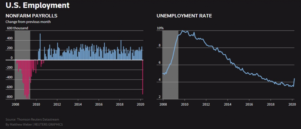
We can see nonfarm payrolls, a summation of payroll jobs available within the non-farm payrolls classification, has reached 2008-09 numbers plummeting 701k last month.
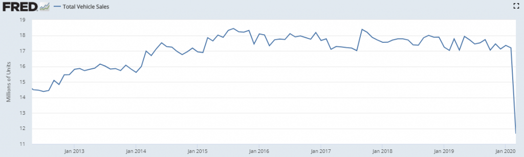
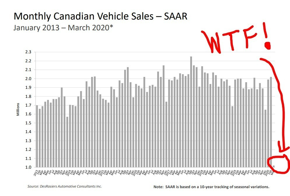
Not surprisingly, US Auto Sales has slummed:
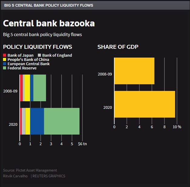
The central banks have already injected more liquidity into the system than 2008-09 relative to GDP:
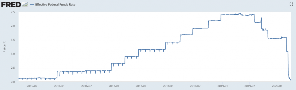
The effective federal fund rate has dropped to zero:
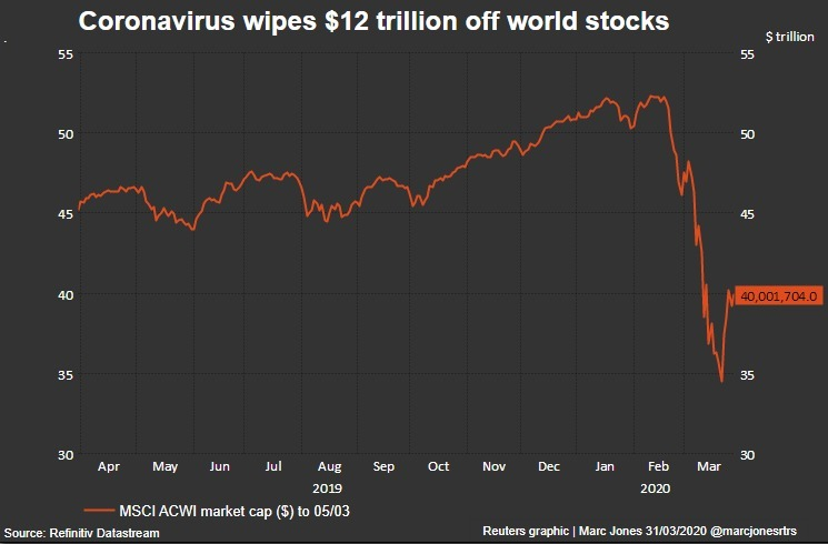
As of April 3rd, global stocks have lost over $12 trillion in value:
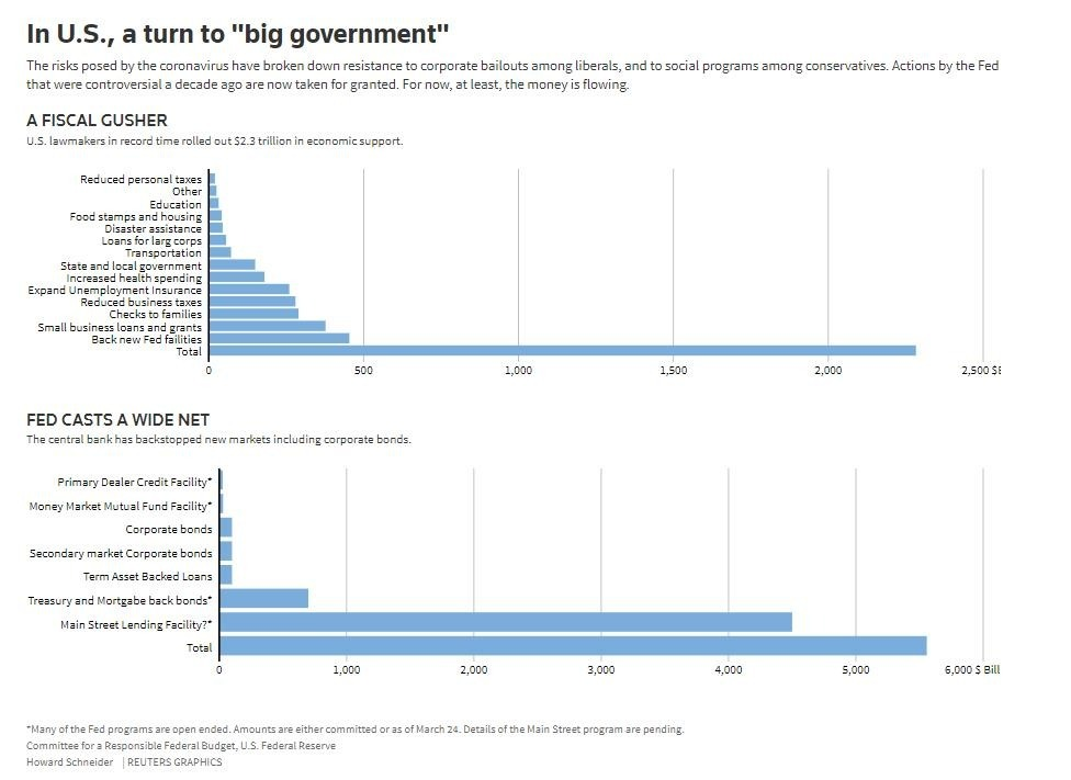
A look at the Fed’s measures to keep liquidity in the system:
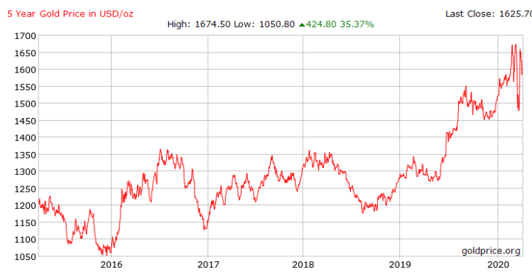
Gold is at 5 year highs, but overall hasn’t moved much:
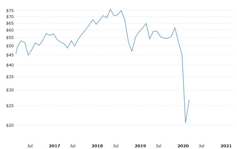
Oil prices have plunged due to lack of demand and increases suprised:
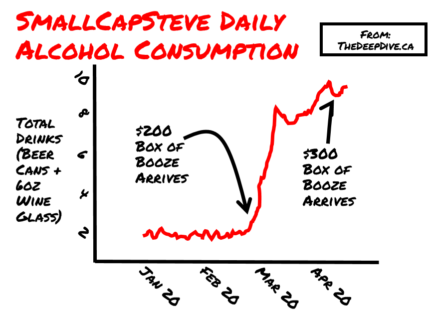
And lastly, SmallCapSteve’s daily alochol consumption:
Information for this briefing was found via the provided sources. The author has no securities or affiliations related to this organization. Not a recommendation to buy or sell. Always do additional research and consult a professional before purchasing a security. The author holds no licenses.